---
title: "Markdown, Automation & HTML Reports (UBISS16, Jul 6)"
author: "Xavier de Pedro, Ph.D. xavier.depedro@vhir.org - https://seeds4c.org/ubiss16d3"
date: "July 6, 2016"
output:
html_document:
number_sections: yes
theme: united
toc: yes
toc_depth: 3
toc_float:
collapsed: yes
smooth_scroll: yes
pdf_document:
highlight: zenburn
toc: yes
runtime: static
params:
n: 100
a: My Name
d: Sys.Date()
---
[//]: # (You can write pure Rmd comments that won't be in the html source this other way )
```{r setup, include=FALSE}
knitr::opts_chunk$set(echo = TRUE)
options(shiny.deprecation.messages=FALSE)
analystName <- "MyName" # (with no spaces, used for some files produced and saved on disk)
```
# Markdown & automation (9-11h)
UBISSS16 Day 3. 9:00 h - 11:00 h (Xavier de Pedro)
http://rpubs.com/Xavi/ubiss16d3
## R Markdown tutorial
Using knitr, r-markdown and Plot.ly.
Some examples from:
* http://rmarkdown.rstudio.com/authoring_quick_tour.html
* http://moderndata.plot.ly/r-markdown-and-knitr-tutorial-part-1/
### Install requirements (only if missing)
You can display the code that is run without showing the usual messages produced in the R console when installing a package or loading a library, by means of using the parameter "message=FALSE":
```{r Install requirements, message=FALSE}
if (!require(rmarkdown, quietly = TRUE)) {
install.packages('rmarkdown', repos='http://cran.rediris.es')
}
if (!require(knitr, quietly = TRUE)) {
install.packages('knitr', repos='http://cran.rediris.es')
}
if (!require(plotly, quietly = TRUE)) {
install.packages('plotly', repos='http://cran.rediris.es')
}
if (!require(readr)) {
install.packages('readr', repos='http://cran.rediris.es')
}
if (!require(xtable)) {
install.packages('xtable', repos='http://cran.rediris.es')
}
if (!require(stargazer)) {
install.packages('stargazer', repos='http://cran.rediris.es')
}
if (suppressPackageStartupMessages(!require(googleVis, quietly = TRUE))) {
install.packages('googleVis', repos='http://cran.rediris.es')
}
if (!require("DT", quietly = T)) {
install.packages('DT', repos = 'http://cran.rstudio.com')
}
if (!require("webshot", quietly = T)) {
install.packages('webshot', repos = 'http://cran.rstudio.com')
}
if (!require("shiny", quietly = T)) {
install.packages('shiny', repos = 'http://cran.rstudio.com')
}
```
Try re-running it with "message=TRUE"
## Overview

Creating documents with R Markdown starts with an .Rmd file that contains a combination of markdown (content with simple text formatting) and R code chunks. The .Rmd file is fed to [knitr](http://yihui.name/knitr/), which executes all of the R code chunks and creates a new markdown (.md) document which includes the R code and it’s output.The markdown file generated by knitr is then processed by [pandoc](http://pandoc.org) which is responsible for creating a finished web page, PDF, MS Word document, slide show, handout, book, dashboard, package vignette or other format.This may sound complicated, but R Markdown makes it extremely simple by encapsulating all of the above processing into a single `render` function. Better still, RStudio includes a “Knit” button that enables you to render an .Rmd and preview it using a single click or keyboard shortcut.
## Usage
You can install the R Markdown package from CRAN as follows:
```
install.packages("rmarkdown")
```
In our case, it was installed (only if needed) in a step above. Once installed, you can open a new .Rmd file in the [RStudio IDE](https://www.rstudio.com/products/rstudio/) by going to File > New File > R Markdown.
### Markdown Basics
Markdown is a simple formatting language designed to make authoring content easy for everyone. Rather than write in complex markup code (e.g. HTML or LaTex), you write in plain text with formatting cues. Pandoc uses these cues to turn your document into attractive output. For example, the file on the left shows basic Markdown and the resulting output on the right:

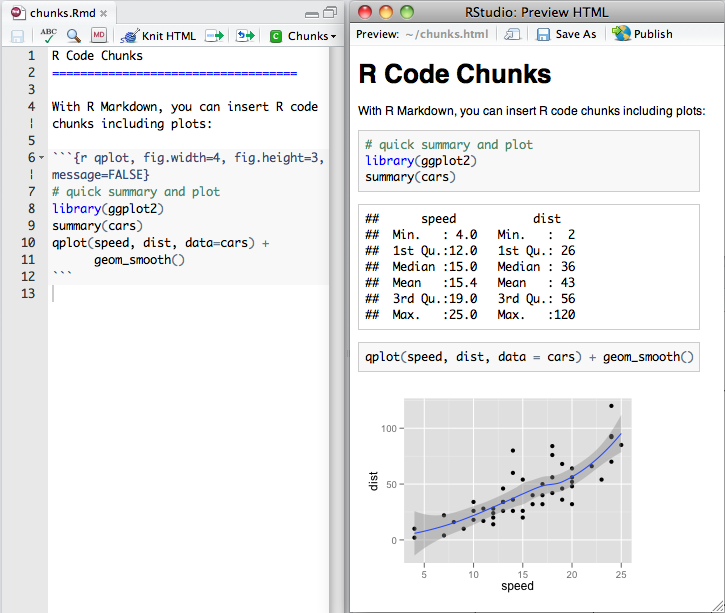
### R Code Chunks
Within an R Markdown file, R Code Chunks can be embedded with the native Markdown syntax for fenced code regions. For example, the following code chunk computes a data summary and renders a plot as a PNG image:
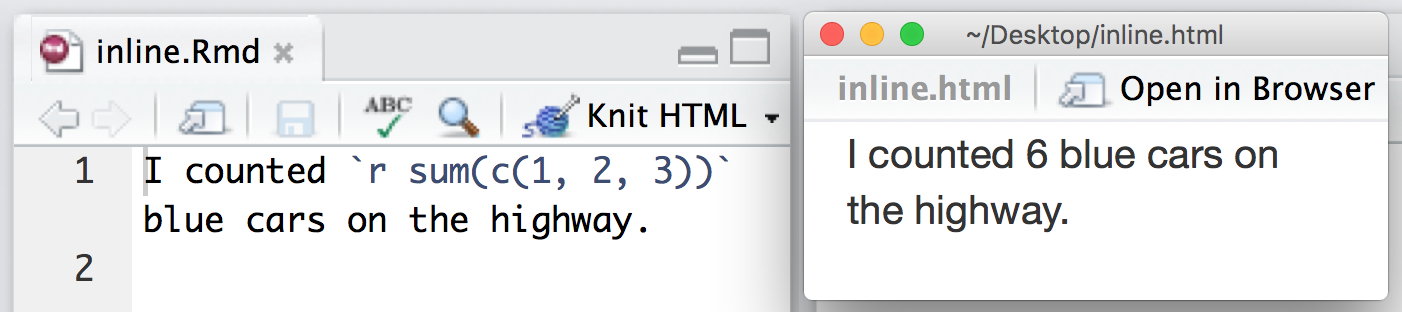
### Inline R Code
You can also evaluate R expressions inline by enclosing the expression within a single back-tick qualified with ‘r’. For example, the following code embeds R results as text in the output at right
### Rendering Output
There are two ways to render an R Markdown document into it’s final output format. If you are using RStudio, then the “Knit” button (Ctrl+Shift+K) will render the document and display a preview of it.If you are not using RStudio then you simply need to call the -+rmarkdown::render+- function, for example:
```
rmarkdown::render("input.Rmd")
```
Note that both methods use the same mechanism; RStudio’s “Knit” button calls `rmarkdown::render()` under the hood.
### Using Parameters
R Markdown documents can contain a metadata section that includes title, author, and date information as well as options for customizing output. For example, this metadata included at the top of an .Rmd file adds a table of contents and chooses a different HTML theme:
```
---
title: "Sample Document"
output:
html_document:
toc: true
theme: united
---
```
You can add a `params` field to the metadata to provide a list of values for your document to use. R Markdown will make the list available as `params` within any R code chunk in the report. For example, the file below takes a filename as a parameter and uses the name to read in a data set.
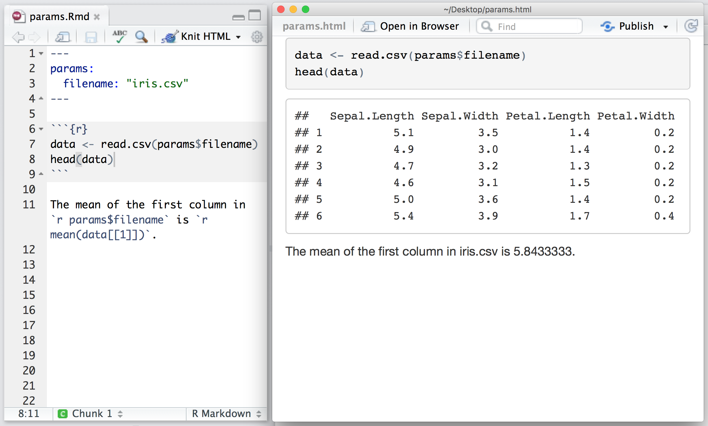
Parameters let you quickly apply your data set to new data sets, models, and parameters. You can set new values for the parameters when you call -+rmarkdown::render()+-,
```
rmarkdown::render("input.Rmd", params = list())
```
as well as when you press the “Knit” button:

### Insert figures
You can insert a simple static figure, for instance, with "hardcoded" paramters, while also displaying the code run that generated it, with the parameter "echo=TRUE":
```{r Generating and inserting a simple figure, echo=TRUE}
x <- 1:10
y <- x^3
plot(x,y)
```
Or you can display an equivalent simple figure using params defined in the markdown header and a few more custom values for plot and axis titles.
```{r Generating and inserting a simple figure using params defined in the markdown header, echo=TRUE}
x <- 1:params$n
y <- x^3
plot(x,
y,
xlab="My X label",
ylab="My Y label",
main="My Chart Title",
sub=paste0("Chart generated on ", params$d, " by ", params$a) # "sub" in a plot stands for subtitle
)
```
Or you can insert an awesome interactive chart, which can be as simple as printing out a "plotly"" object in a code chunk. Use the code snippet below, after fetching the data and functions.
### Eval and Echo params
Dowload the function definition for GetYAhooData() here:
https://github.com/royr2/StockPriceAnalytics/blob/master/support/Yahoo%20Stock%20Data%20Pull.R
Click at "Raw" in that page on Github to get the clean code as a "source" for a script to run
Here you get the display of a code chunk without evaluating it, and therefore, without printing the results from the R console after it is run:
```{r display code source "Yahoo Stock Data Pull.R", eval=FALSE}
source("https://raw.githubusercontent.com/royr2/StockPriceAnalytics/master/support/Yahoo%20Stock%20Data%20Pull.R")
AAPL <- GetYahooData("AAPL")
IBM <- GetYahooData("IBM")
```
And here you get the output of running the code chunk without displaying the source code:
```{r run source "Yahoo Stock Data Pull.R", echo=FALSE}
source("https://raw.githubusercontent.com/royr2/StockPriceAnalytics/master/support/Yahoo%20Stock%20Data%20Pull.R")
AAPL <- GetYahooData("AAPL")
IBM <- GetYahooData("IBM")
```
Let's produce the interactive graph embedded in our Rmarkdown report:
```{r Inserting an interactive graph, echo=TRUE}
# Plotly chart
library(plotly)
mat <- data.frame(Date = AAPL$Date,
AAPL = round(AAPL$Adj.Close,2),
IBM = round(IBM$Adj.Close,2))
p <- mat %>%
plot_ly(x = Date, y = AAPL, fill = "tozeroy", name = "Microsoft") %>%
add_trace(y = IBM, fill = "tonexty", name = "IBM") %>%
layout(title = "Stock Prices",
xaxis = list(title = "Time"),
yaxis = list(title = "Stock Prices"))
p # Thats it !
```
## Case study
```
Task for YOU:
* Reproduce this example but selecting just one district of the whole Data set, different from the one shown in the subset example below (e.g. different from "Sants-Montjuïc"), and display the equivalent adapted tables.
* By the end of the day (after second part), you will be able to publish your report on the internet and send the link to the professor's email: xavier.depedro@seeds4c.org .
** For this second part, you need to register an account at https://rpubs.com (it's a free and easy process but you may need to validate an email that may take a while to reach your account, so we'd better start the account creation now)
```
### Fetch Data & Plot chart
First, let's get the data set we will be playing with.
http://www.aspb.cat/quefem/docs/InformeSalut2014_2010.pdf
Massaged with this custom code:
https://github.com/xavidp/rscripts/blob/master/tabulizer_summer_school_ub_2016.R
Data set:
* ODS https://seeds4c.org/tiki-download_file.php?fileId=452
* CSV https://seeds4c.org/tiki-download_file.php?fileId=453
```{r Fetch the dataset InformeSalut2014_2010.csv}
require(knitr)
getwd()
datafile <- "InformeSalut2014_2010.csv"
download.file(url="https://seeds4c.org/tiki-download_file.php?fileId=453", destfile=datafile)
# Take 1 at reading a csv file into R, with default function read.csv
my.data <- read.csv(datafile, check.names=FALSE)
vnames <- colnames(my.data)
colnames(my.data) <- c("District", "Suburb", paste0("V", 1:13))
dim(my.data)
head(my.data)
# As you can see there is an extra column that came with a note, and not real data. Therefore, we can remove it
tablelegend <- cbind(colnames(my.data[1:14]), vnames[1:14])
tablelegend <- rbind(tablelegend, unlist(strsplit(vnames[15], ":")))
colnames(tablelegend) <- c("Variable Code", "Variable Description")
knitr::kable(tablelegend, caption = "Table with kable")
# As you can see, all columns where taken as factors, and not as numbers.
str(my.data)
# Take 2 at reading the file, this time with readr package, since it's better for performance and
# for self-detecting data types: numbers as numbers and not as factors, for instance, in this example.
my.data <- readr::read_csv(datafile)
vnames <- colnames(my.data)
my.data<-my.data[,-15]
colnames(my.data) <- c("District", "Suburb", paste0("V", 1:12))
str(my.data)
# Take 3 at reading the file, this time setting the locale properly to indicate that the dataset came with the decimal mark also as a comma, besides the field delimiter. Field delimiter also comes surrounded by quotation marks, therefore there is no confusion with this format.
# We will finally detect all numbers as numbers and not as factors
my.data <- readr::read_csv(datafile, locale=readr::locale("es", decimal_mark = ","))
vnames <- colnames(my.data)
my.data<-my.data[,-15]
colnames(my.data) <- c("District", "Suburb", paste0("V", 1:12))
str(my.data)
```
### Transform data set?
You might want to aggregate by District:
```{r}
my.ag.data <-aggregate(my.data[,3:14], by=list(my.data$District),
FUN=mean, na.rm=TRUE)
my.ag.data
```
or you may want to subset Districts and eventually remove some column (V12 in this example):
```{r results = 'asis'}
my.subset <- subset(my.data, District == "Sants-Montjuïc", select = -V12)
knitr::kable(my.subset, caption = "Table with kable")
```
```
TASK:
Subset the generic my.data set to get just one District.
```
### Static tables using ...{.tabset .tabset-fade .tabset-pills}
Click below on the different names (`Kable`, `Xtable`, `Stargazer`, `formattable`), to open the tabs with more information about each option. This display is organized within tabs ("tabbed" display; see the R Markdown document to see how it was generated).
#### Kable
```{r results = 'asis'}
knitr::kable(head(my.data[,1:5]), caption = "Table with kable")
```
#### Xtable
```{r results = "asis"}
print(xtable::xtable(head(my.data[,1:5]), caption = "Table with xtable"),
type = "html", html.table.attributes = "border=1")
```
#### Stargazer
```{r results = "asis"}
stargazer::stargazer(head(my.data[,1:5]), type = "html",
title = "Table with stargazer", summary=FALSE)
```
#### Formattable
For those interested in table display of their results, there is another type of displaying tabular data with custom formats depending of the values shown, which is called [formattable](http://renkun.me/formattable/). It didn't work by default with the provided examples, but for sure it's a very promising package to improve the display of results in tables (at least for printing in color).
See: http://renkun.me/formattable/
##### tabset end
End of display of static tables in a set of tabs
### Dynamic tables (i): gvT
gVT stands for GoogleVistTable, which is a dynamic table display from the GoogleVis R package. It allows you, at least, to sort columns based on their values in real time, and with some extra work, you would be able to paint cells based on some logic in your scripts (values, legend codes from figures, etc; see its [documentation pages](https://cran.r-project.org/web/packages/googleVis/vignettes/googleVis_examples.html)).
```{r Display my.data set in a Table, results='asis', tidy=TRUE}
require(googleVis)
#Set the googleVis options first to change the behaviour of plot.gvis, so that only the chart component of the HTML file is written into the output file.
op <- options(gvis.plot.tag='chart')
# Make a clone of my.data, with a first extra column for id or samples (with 2 digits for easy re-sorting later on)
my.data.indexed <- cbind(sprintf("%02d", as.numeric(rownames(my.subset))), my.subset)
colnames(my.data.indexed)[1] <- "#"
## Table with enabled paging
gvT <- gvisTable(my.data.indexed, options=list(page='disable',
height='automatic',
width='automatic'))
plot(gvT)
# save the googlevis table to disk
# Assign file name for the my.data.indexed
outFileName <- paste("my.subset", analystName, format(Sys.Date(), "%y%m%d"), "indexed.html", sep=".")
# Display just the chart in the generated html
cat(gvT$html$chart, file=outFileName)
```
### Dynamic tables (ii): DT
The R package DT provides an R interface to the JavaScript library [DataTables](http://datatables.net). R data objects (matrices or data frames) can be displayed as tables on HTML pages, and DataTables provides filtering, pagination, sorting, and many other features in the tables.
```{r}
require('DT')
d = data.frame(
my.data,
stringsAsFactors = FALSE
)
dt <- datatable(d, filter = 'bottom', options = list(pageLength = 5)) %>%
formatStyle('V1',
color = styleInterval(c(0.5, 56), c('black', 'red', 'blue')),
backgroundColor = styleInterval(56.5, c('snow', 'lightyellow')),
fontWeight = styleInterval(58.0, c('italics', 'bold')))
```
***
Display within this Rmd file the dynamic table produced
```{r}
dt
```
***
You can also save the whole dynamic table in its own html file, to reuse elsewhere
or display in full width, etc.
```{r}
saveWidget(dt, paste("my.data", analystName, format(Sys.Date(), "%y%m%d"),'summary.html', sep="."))
```
## Questions?
Ask in class to your course mates or directly to the professor.
# Reports in html (11:30-13:30h)
You have produced your analysis results, and you want to tell the world (or your customer) about it, without requiring complicated steps (requiring specific programs that might not be available in the computer or mobile device of your readers) to view your results.
You can use html reports, so that they can be easily seen by anyone, regardless of the Operating System they use, or device (tablet, smartphone, ...), and they can be seen at any time.
## Custom reports via markdown + knitr
Write html reports with R Markdown from R Studio. In a similar fashion to what you have seen here in this example.
See another example, for instance, here:
http://www.jacolienvanrij.com/Tutorials/tutorialMarkdown.html
## Custom reports via R packages. Eg. Noozle.R1
Nozzle is an R package that provides an API to generate HTML reports with dynamic user interface elements based on JavaScript and CSS (Cascading Style Sheets). Nozzle was designed to facilitate summarization and rapid browsing of complex results in data analysis pipelines where multiple analyses are performed frequently on big data sets. The package can be applied to any project where user-friendly reports need to be created.
See more here:
* https://github.com/parklab/nozzle
* https://confluence.broadinstitute.org/display/GDAC/Nozzle
* https://cran.r-project.org/web/packages/Nozzle.R1/
You could publish this type of reports by means of uploading the html generated plus the png images and corresponding pdf files produced and linked from your report to some web or ftp/sftp server, for instance, that you or your work institution have access to, in order to leave the report web accessible by others through the web browser of through public ftp accounts.
## Embed dynamic objects
Beyond [static charts and graphs](www.joyce-robbins.com/wp-content/uploads/2016/04/effectivegraphsmro1.pdf) and beyond [dynamic tables](https://rstudio.github.io/DT/): maps, other plot.ly charts, Rcharts & htmlwidgets, animations, Shiny apps, ...
### Maps with Plot.ly (i)
```{r}
# Learn about API authentication here: https://plot.ly/r/getting-started
# Find your api_key here: https://plot.ly/settings/api
df <- read.csv('https://raw.githubusercontent.com/plotly/datasets/master/2014_world_gdp_with_codes.csv')
# light grey boundaries
l <- list(color = toRGB("grey"), width = 0.5)
# specify map projection/options
g <- list(
showframe = FALSE,
showcoastlines = FALSE,
projection = list(type = 'Equirectangular') # Instead of the usual but very biased 'Mercator' projection
)
plot_ly(df, z = GDP..BILLIONS., text = COUNTRY, locations = CODE, type = 'choropleth',
color = GDP..BILLIONS., colors = 'Blues', marker = list(line = l),
colorbar = list(tickprefix = '$', title = 'GDP Billions US$')) %>%
layout(title = '2014 Global GDP
Source:CIA World Factbook',
geo = g)
```
### Maps with Plot.ly (ii)
```{r Choropleth Inset Map}
df <- read.csv('https://raw.githubusercontent.com/plotly/datasets/master/2014_ebola.csv')
# restrict from June to September
df <- subset(df, Month %in% 6:9)
# ordered factor variable with month abbreviations
df$abbrev <- ordered(month.abb[df$Month], levels = month.abb[6:9])
# September totals
df9 <- subset(df, Month == 9)
# common plot options
g <- list(
scope = 'africa',
showframe = F,
showland = T,
landcolor = toRGB("grey90")
)
g1 <- c(
g,
resolution = 50,
showcoastlines = T,
countrycolor = toRGB("white"),
coastlinecolor = toRGB("white"),
projection = list(type = 'Mercator'),
list(lonaxis = list(range = c(-15, -5))),
list(lataxis = list(range = c(0, 12))),
list(domain = list(x = c(0, 1), y = c(0, 1)))
)
g2 <- c(
g,
showcountries = F,
bgcolor = toRGB("white", alpha = 0),
list(domain = list(x = c(0, .6), y = c(0, .6)))
)
plot_ly(df, type = 'scattergeo', mode = 'markers', locations = Country,
locationmode = 'country names', text = paste(Value, "cases"),
color = as.ordered(abbrev), marker = list(size = Value/50), inherit = F) %>%
add_trace(type = 'scattergeo', mode = 'text', geo = 'geo2', showlegend = F,
lon = 21.0936, lat = 7.1881, text = 'Africa') %>%
add_trace(type = 'choropleth', locations = Country, locationmode = 'country names',
z = Month, colors = "black", showscale = F, geo = 'geo2', data = df9) %>%
layout(title = 'Ebola cases reported by month in West Africa 2014
Source: HDX',
geo = g1, geo2 = g2)
```
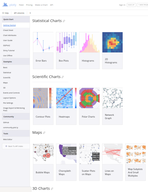
### Other plot.ly charts
See other plot.ly charts and applications, from several categories:
* Basic
* Statistical
* Scientific
* Maps
* 3D
* Add events ad controls
***
***
### Google Charts (other than tables)
See googleVis examples:
https://cran.r-project.org/web/packages/googleVis/vignettes/googleVis_examples.html
### RCharts & htmlwidgets
The **rCharts** is an R package to create, customize and publish interactive javascript visualizations from R using a familiar lattice style plotting interface.
See: http://rcharts.io
The **htmlwidgets** package brings the best of JavaScript data visualization to R. Use JavaScript visualization libraries at the R console, just like plots. Embed widgets in R Markdown documents and Shiny web applications. Develop new widgets using a framework that seamlessly bridges R and JavaScript
See:
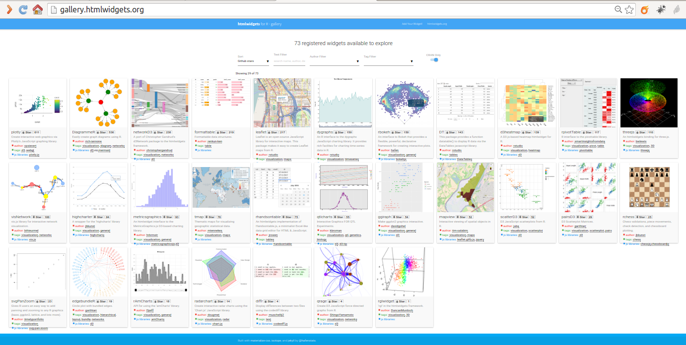
* http://www.htmlwidgets.org
* http://gallery.htmlwidgets.org/
### Inserting Shiny Apps
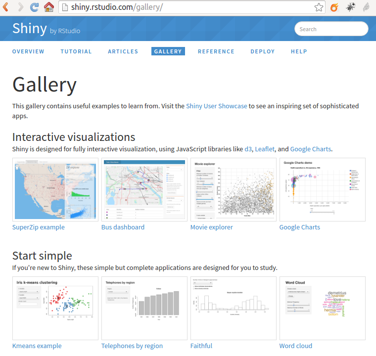
[Shiny](http://shiny.rstudio.com/) is a web application framework for R. You can turn your analyses into interactive web applications, without much previous knowledge of HTML, CSS, or JavaScript being required.
You can insert a shiny application in your Markdown document if you change the paramter `runtime: static` into `runtime: shiny`. Try that, and then set the chunk parameter to eval=TRUE to run this chunk of code and get the shiny application displayed here below:
```{r, echo = TRUE, eval=FALSE}
source("https://raw.githubusercontent.com/rstudio/rmdexamples/master/R/kmeans_cluster.R")
kmeans_cluster(iris)
```
### Where to publish your reports
Easy web publishing from R with **RPubs** (among others). Write R Markdown documents in RStudio.
Share them here on [RPubs](rpubs.com). (It’s free, and couldn’t be simpler!)
See http://rpubs.com/about/getting-started
RStudio lets you harness the power of R Markdown to create documents that weave together your writing and the output of your R code. And now, with RPubs, you can publish those documents on the web with the click of a button!
Prerequisites
You'll need R itself, RStudio (v0.96.230 or later), and the knitr package (v0.5 or later).
Instructions
In RStudio, create a new R Markdown document by choosing File | New | R Markdown.
Click the Knit HTML button in the doc toolbar to preview your document.
In the preview window, click the Publish button.
## Case study
```
Task for YOU:
* Add a the equivalent Plot.ly scatter plot in your report, as the one shown below, but for the same subset of data that you did in the previous part of the session today.
* Publish your report on the internet at [RPubs](rpubs.com) and send the link to the professor's email: xavier.depedro@seeds4c.org .
```
```{r Create a plot.ly chart out of the previous dataset}
require(knitr)
getwd()
datafile <- "InformeSalut2014_2010.csv"
download.file(url="https://seeds4c.org/tiki-download_file.php?fileId=453", destfile=datafile)
# Get all data in place
my.data <- readr::read_csv(datafile, locale=readr::locale("es", decimal_mark = ","))
vnames <- colnames(my.data)
my.data<-my.data[,-15]
colnames(my.data) <- c("District", "Suburb", paste0("V", 1:12))
str(my.data)
# As you can see there is an extra column that came with a note, and not real data. Therefore, we can remove it
tablelegend <- cbind(colnames(my.data[1:14]), vnames[1:14])
tablelegend <- rbind(tablelegend, unlist(strsplit(vnames[15], ":")))
colnames(tablelegend) <- c("Variable Code", "Variable Description")
knitr::kable(tablelegend, caption = "Table with kable")
# Simple interactive scatter chart
library(plotly)
# Add some info about variables displayed
cat(paste0("V3: ", tablelegend[5,2]),
paste0("\nV5: ", tablelegend[7,2]),
paste0("\nV6: ", tablelegend[8,2]),
paste0("\nV11: ", tablelegend[13,2]))
plot_ly(my.data,
x = V5, y = V6, text = paste("Over-aging: ", V1,
"Income: ", V3,
"Fecundity: ", V11,
"Suburb: ", Suburb),
mode="marker",
size = V3, opacity = V3,
group = District)
```
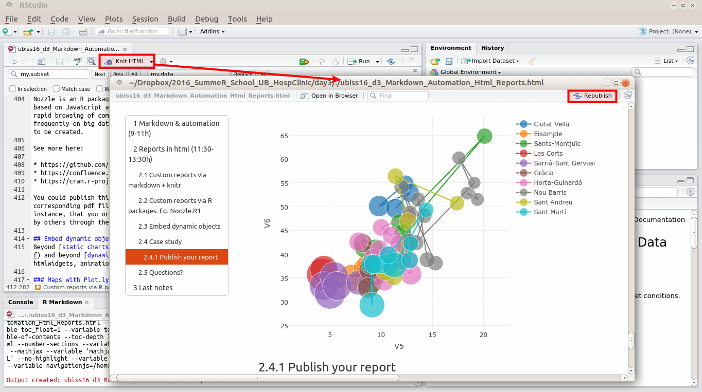
### Publish your report
Publish your report at [RPubs](rpubs.com), with the account your registered earlier today.
If needed, see again: http://rpubs.com/about/getting-started
In RStudio, create a new R Markdown document by choosing File | New | R Markdown.
Click the Knit HTML button in the doc toolbar to preview your document.
In the preview window, click the Publish button.
Once published, if you make new changes to your document, you have the option to republish the updated version to the same url, or publish a new document.
## Questions?
Ask in class to your course mates or directly to the professor, if time permits.
# Last notes
This document has been produced with the following paramters in the R Markdown document and the corresponding versions of R packages:
## Markdown header parameters
```{r eval=FALSE}
---
title: "Markdown, Automation & HTML Reports (UBISS16, Jul 6)"
author: "Xavier de Pedro, Ph.D. xavier.depedro@vhir.org - https://seeds4c.org/ubiss16d3"
date: "July 6, 2016"
output:
html_document:
toc: true
number_sections: true
toc_depth: 3
toc_float:
collapsed: true
smooth_scroll: true
theme: united
pdf_document:
toc: true
highlight: zenburn
runtime: static
params:
n: 100
d: !r Sys.Date()
a: "My Name"
---
```
## Generate R or PDF from Rmd
You can extract all the R commands our of the R Markdown document (Rmd) by means of using the `purl` command, from knitr package:
```{r extract R from Rmd, eval=FALSE}
wd <- "/home/xavi/Dropbox/2016_SummeR_School_UB_HospClinic/day3"
myfile <- file.path(wd, "ubiss16_d3_Markdown_Automation_Html_Reports.Rmd")
knitr::purl(myfile)
```
If you are using `rmarkdown::render` then you can pass a format name to render to select from the available formats. For example:
```{r Generate pdf output from Rmd, eval=FALSE}
wd <- "/home/xavi/Dropbox/2016_SummeR_School_UB_HospClinic/day3"
myfile <- file.path(wd, "ubiss16_d3_Markdown_Automation_Html_Reports.Rmd")
rmarkdown::render(myfile, "pdf_document")
# You can also render all formats defined in an input file with:
rmarkdown::render(myfile, "all")
```
## Session info
```{r show session info}
sessionInfo()
```
```{r}
## Set options back to original options
options(op)
```